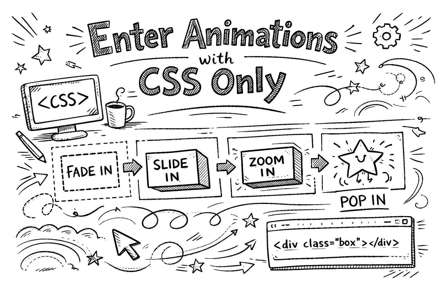
Enter Animations with CSS Only
In modern web development, animations play a crucial role in enhancing user experience. While JavaScript libraries offer powerful animation capabilities, CSS-only animations provide a lightweight and efficient alternative for simple effects. They also offer the advantage of preventing FOUC (Flash of Unstyled Content) In this blog post, we will explore how to create clever enter animations using only CSS, without relying on JavaScript.
Here’s a sneak peek of what we’ll be building:
Boost your sales with powerful animations and engaging content
Watch your conversions soar as visitors are captivated by stunning visuals
Why CSS-Only Animations?
CSS-only animations are beneficial for several reasons:
- Performance: CSS animations are typically more performant than JavaScript-based animations, as they can be optimized by the browser.
- Simplicity: They are easier to implement and maintain, especially for simple animations.
- No Dependencies: They eliminate the need for additional libraries, reducing the overall bundle size of your application.
- Prevent FOUC: By defining animations in CSS, you can avoid flashes of unstyled content during page load.
They also respect user preferences for reduced motion, enhancing accessibility.
Let’s dive into how to create a simple fade-in animation using CSS.
/* Only for users without reduced motion preference */
@media (prefers-reduced-motion: no-preference) {
  /* Notice that we define the END state of our animation */
  .fade-in {
    transition-property: opacity, transform;
    transition-duration: 0.5s;
    transition-timing-function: ease-in-out;
    opacity: 1;
    transform: translateY(0);
    transition-delay: attr(data-delay ms, var(--delay, 0ms));

    /* This is very important, as it defines the starting state */
    @starting-style {
      opacity: 0;
      transform: translateY(0.5rem);
    }
  }
}
Let’s break this down:
- We use the
@media (prefers-reduced-motion: no-preference)query to ensure that our animation only applies to users who have not indicated a preference for reduced motion. - The
.fade-inclass defines the end state of our animation:opacity: 1andtransform: translateY(0). - The
@starting-styleat-rule specifies the initial state of the element before the transition begins:opacity: 0andtransform: translateY(0.5rem). - The
transition-delay: attr(data-delay ms, var(--delay, 0ms));allows us to set a delay for the animation based on a custom data attribute, enabling staggered animations. We also provide a fallback using a CSS variable.
For those not yet familar with the @starting-style at-rule, it allows you to define the initial state of an element before a transition (or animation) begins. This is crucial for our enter animation.
You can start using the
@starting-styletoday, it is baseline supported in all major browsers since August 2024!
<div class="fade-in" data-delay="100">Content to animate in</div>
<div class="fade-in" data-delay="200">Another content to animate in</div>
In this example, each <div> will fade in with a staggered delay based on the data-delay attribute.
Boost your sales with powerful animations and engaging content
Watch your conversions soar as visitors are captivated by stunning visuals
Conclusion
CSS-only enter animations provide a simple and efficient way to enhance user experience without the overhead of JavaScript. By leveraging the @starting-style at-rule and CSS transitions, you can create engaging animations that respect user preferences and improve the overall feel of your web applications. Give it a try in your next project!
